Resource Hub
Insights For Every Screen.
Stories, articles, announcements and everything you need to know.

Quick jump to a resource
Latest


Videos
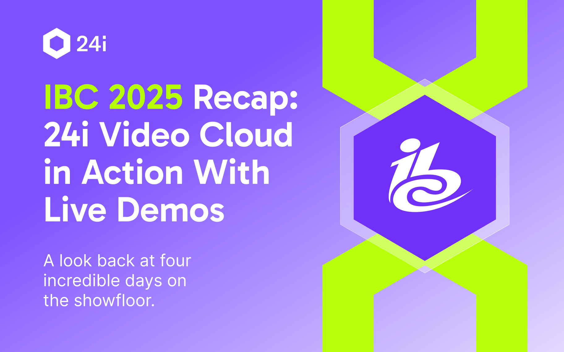

IBC 2025 Recap: 24i Video Cloud in Action
24i video cloud in action at IBC 2025 with inspiring conversations on the future of streaming.
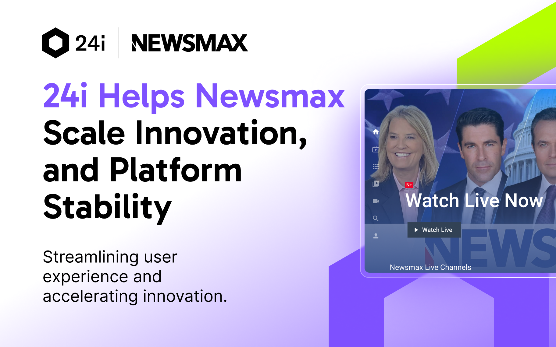
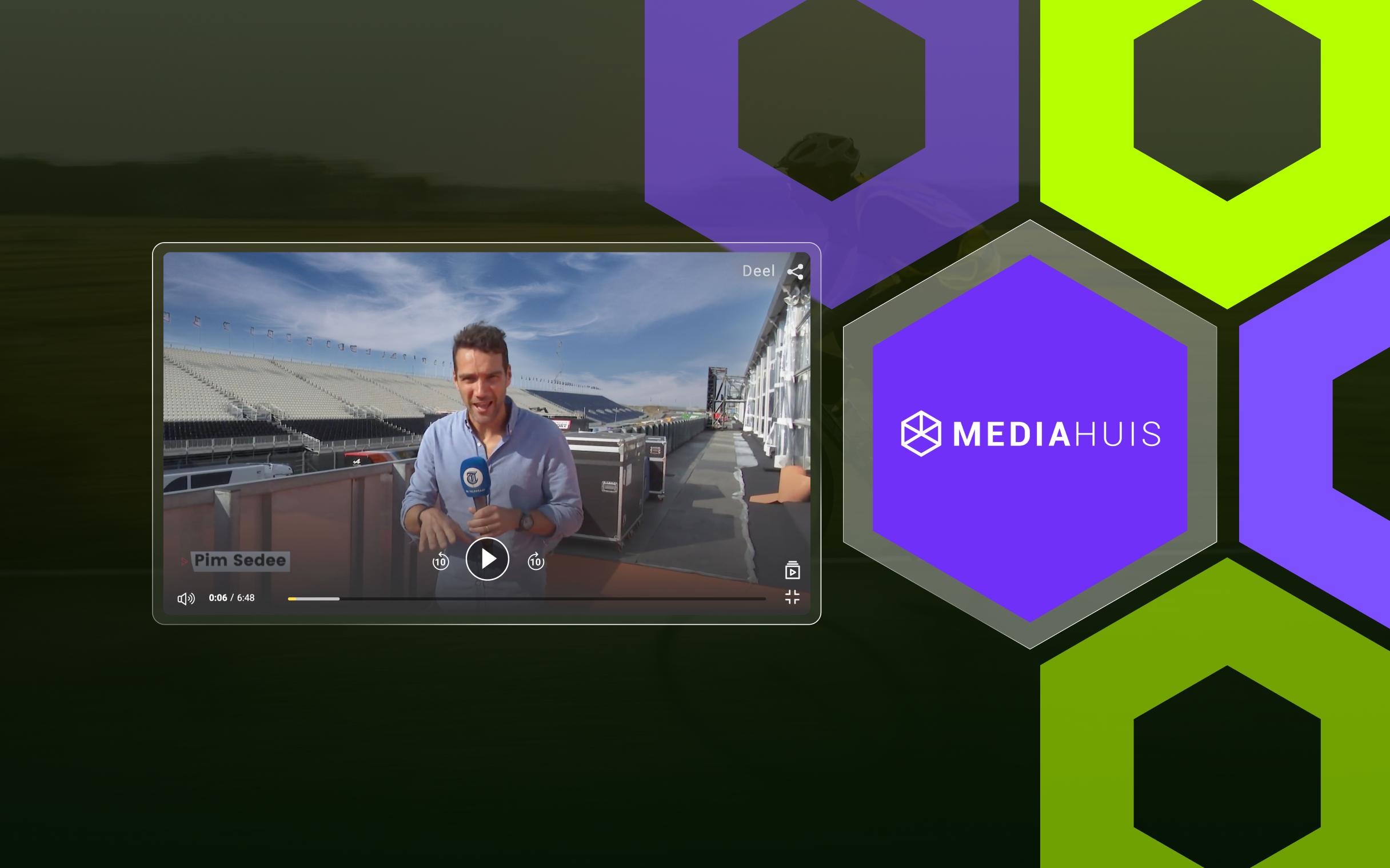
24i Helps Newsmax Scale Innovation, and Platform Stability
Discover how Newsmax, one of the fastest-growing news networks in the U.S., partnered with 24i to scale its digital operations
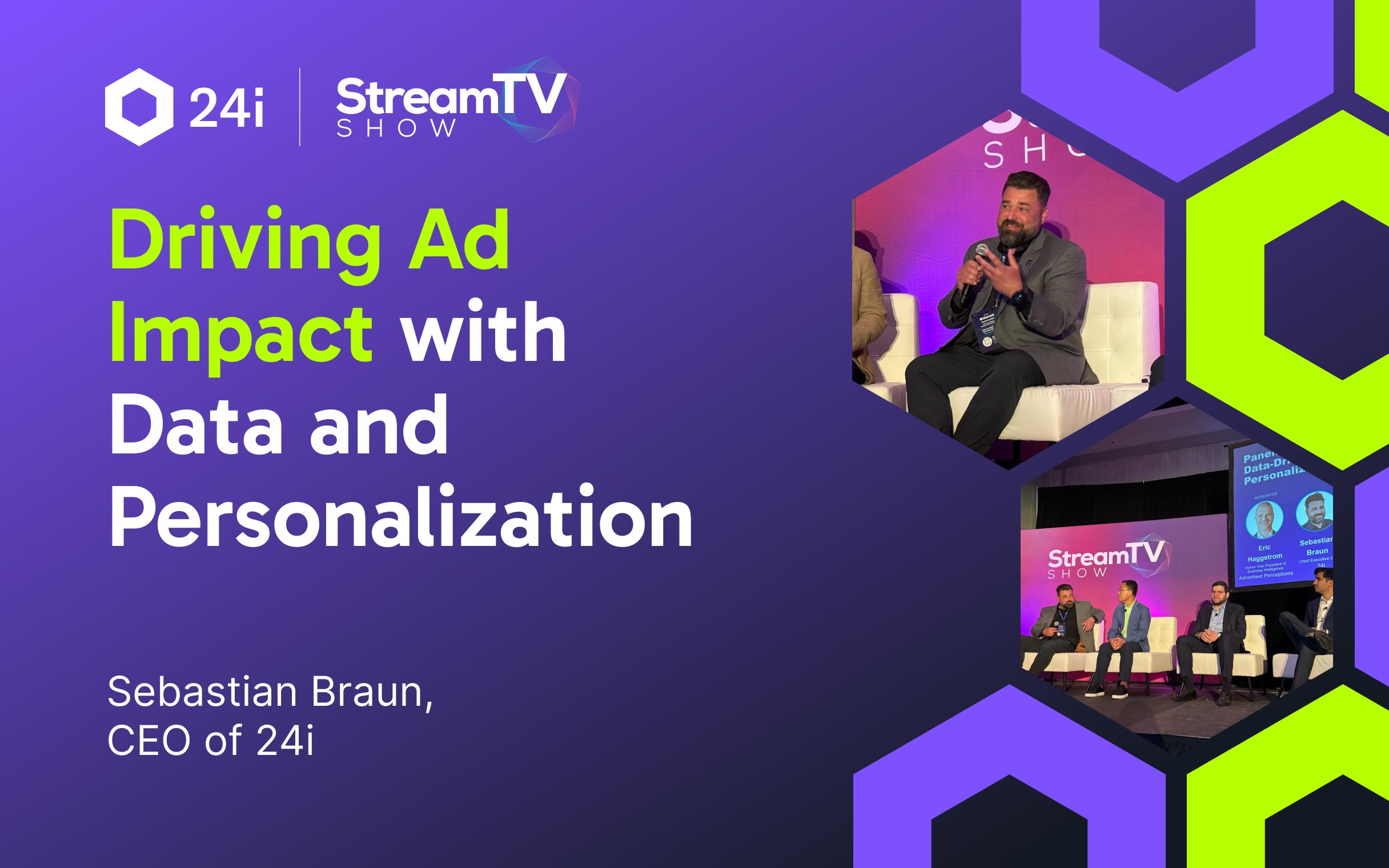
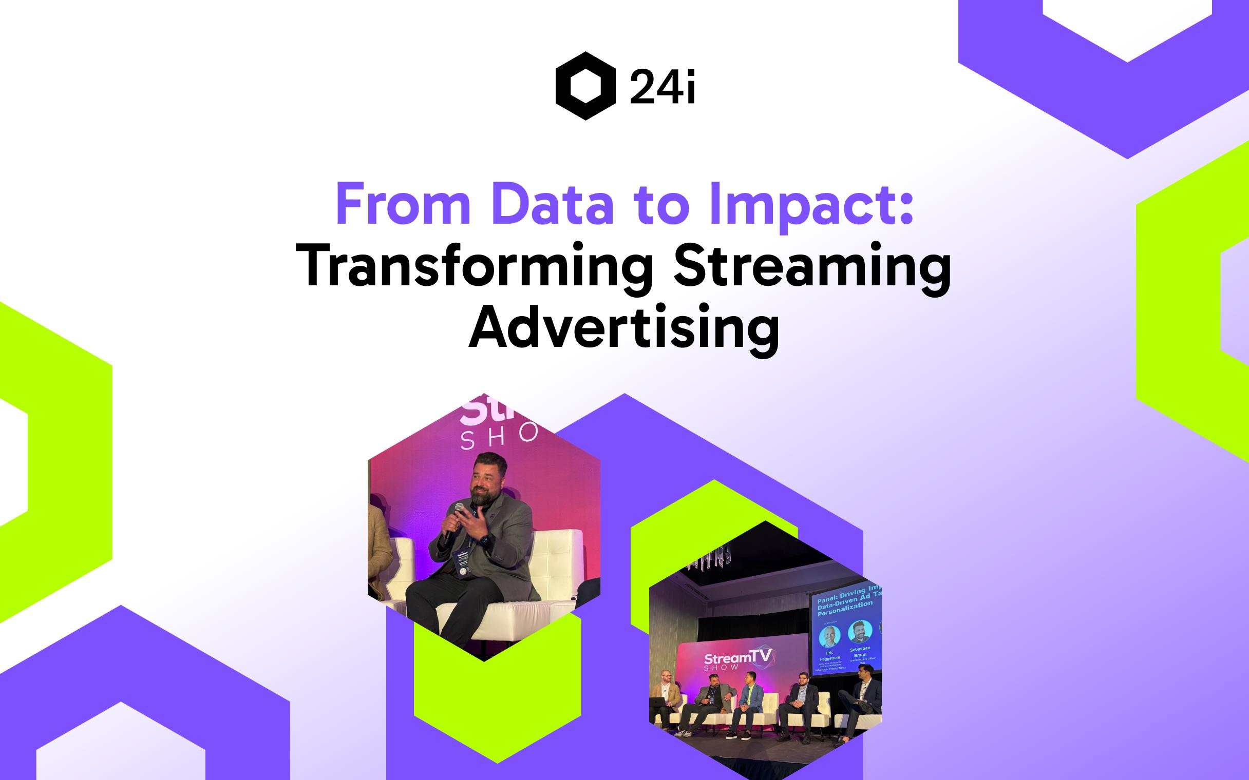
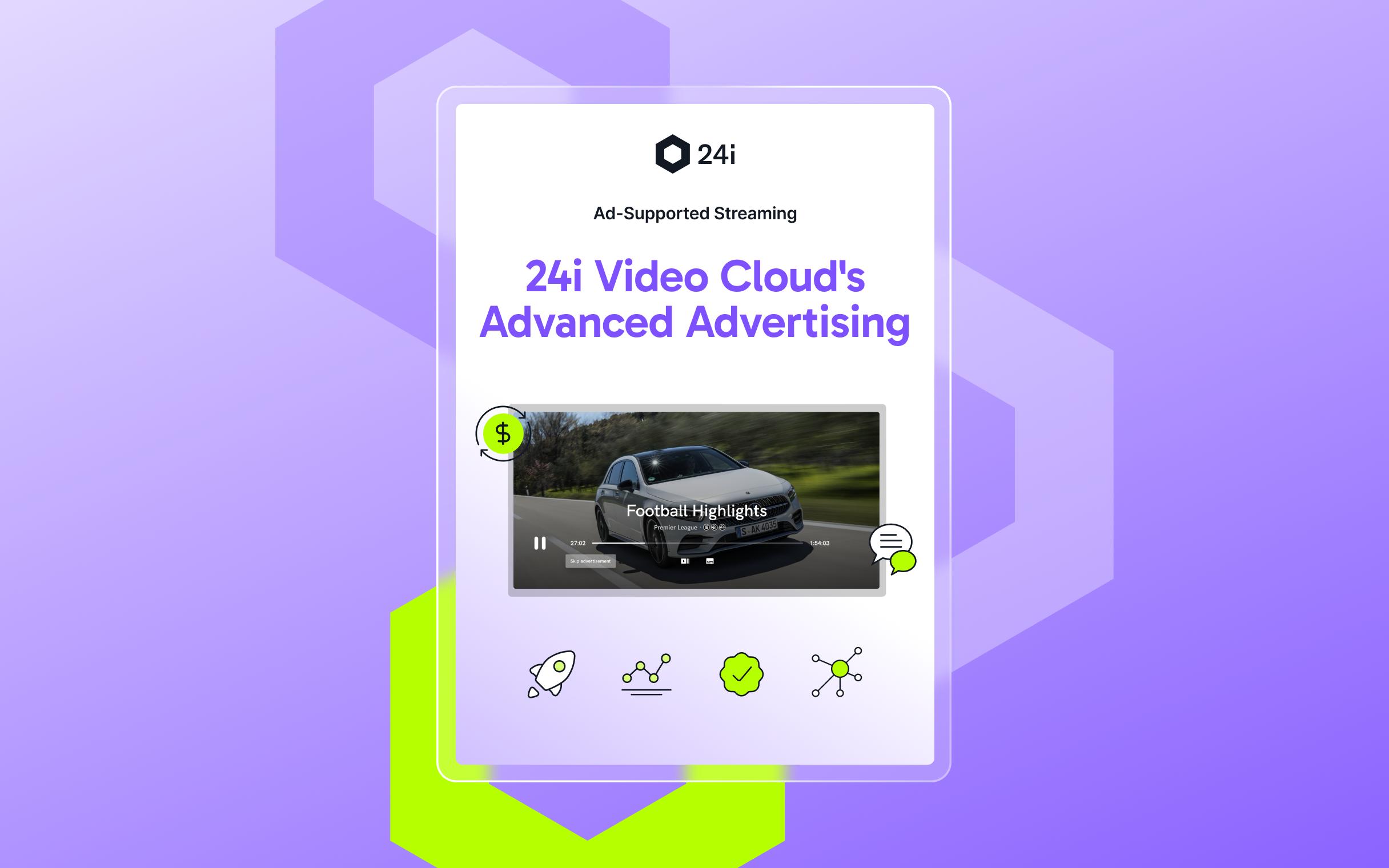
Driving Ad Impact with Data and Personalization
Watch 24i CEO Sebastian Braun live from Stream TV Show 2025 as he joins a panel of industry experts to explore how data and AI are redefining advertising success.
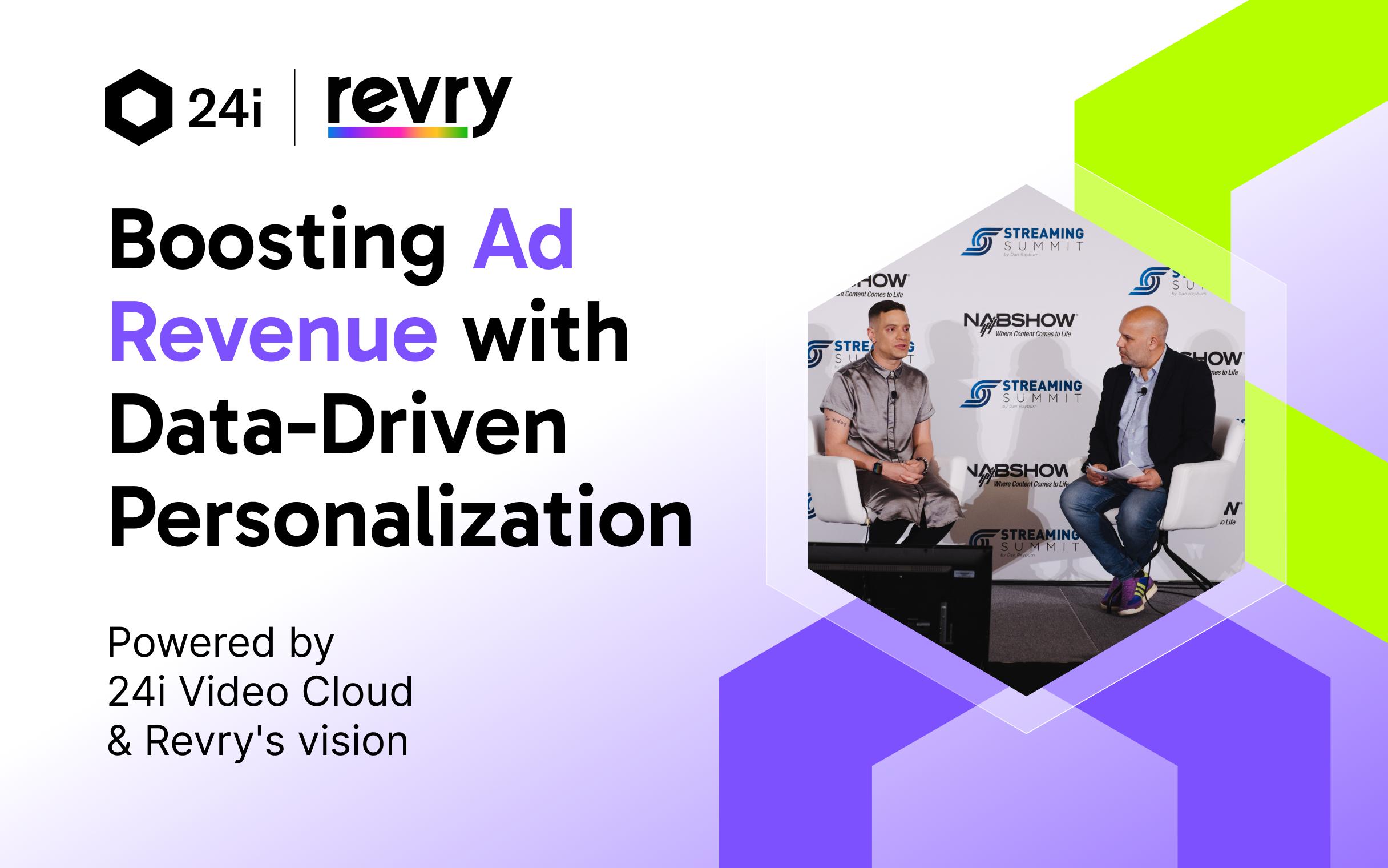
Data-Driven Success: 24i & Revry on Personalization & Ad Revenue
Revry’s Damian Pelliccione and 24i’s Stuart Huke discuss how data intelligence and advanced personalization drive ad revenue growth.
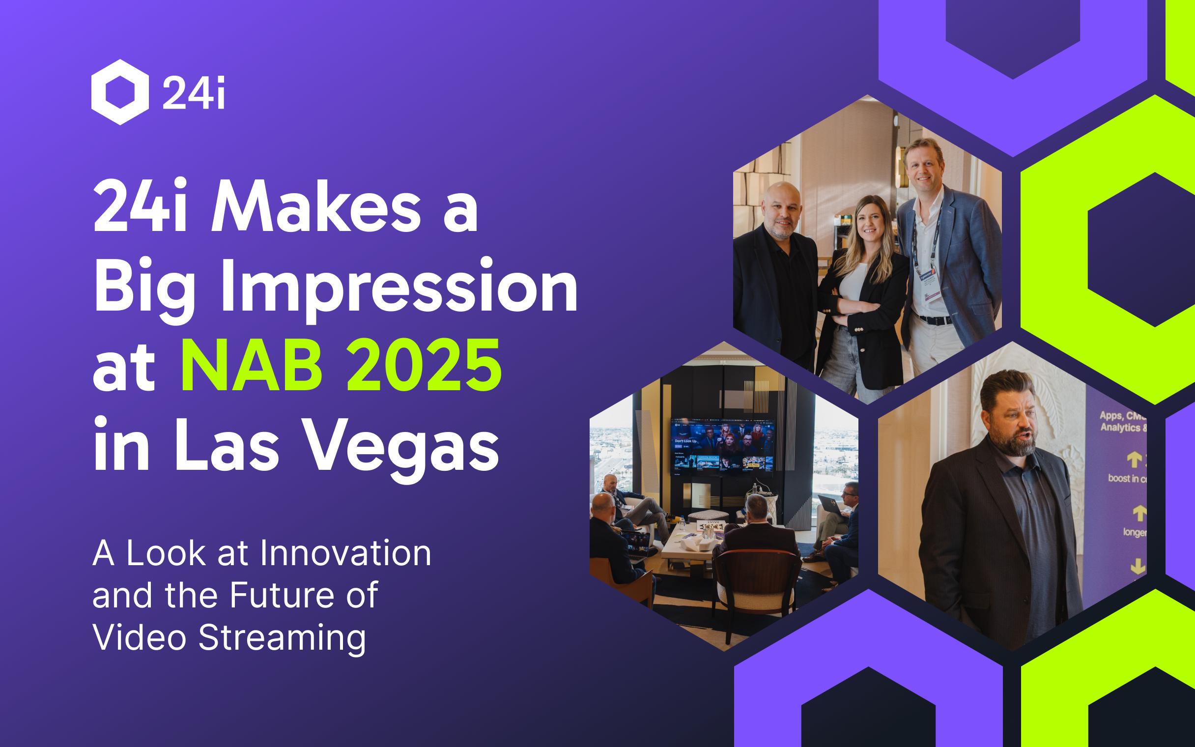
24i Makes a Big Impression at NAB 2025 in Las Vegas
From unveiling bold innovations like Advanced Advertising to inspiring conversations with industry leaders, 24i made waves in the world of video streaming.
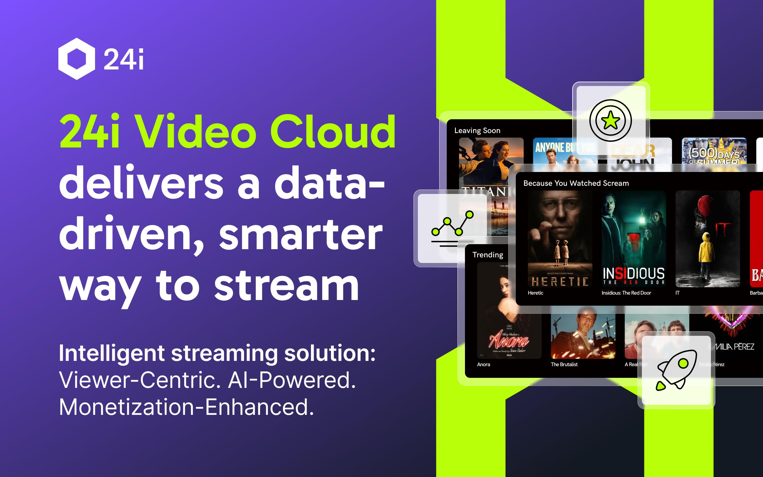
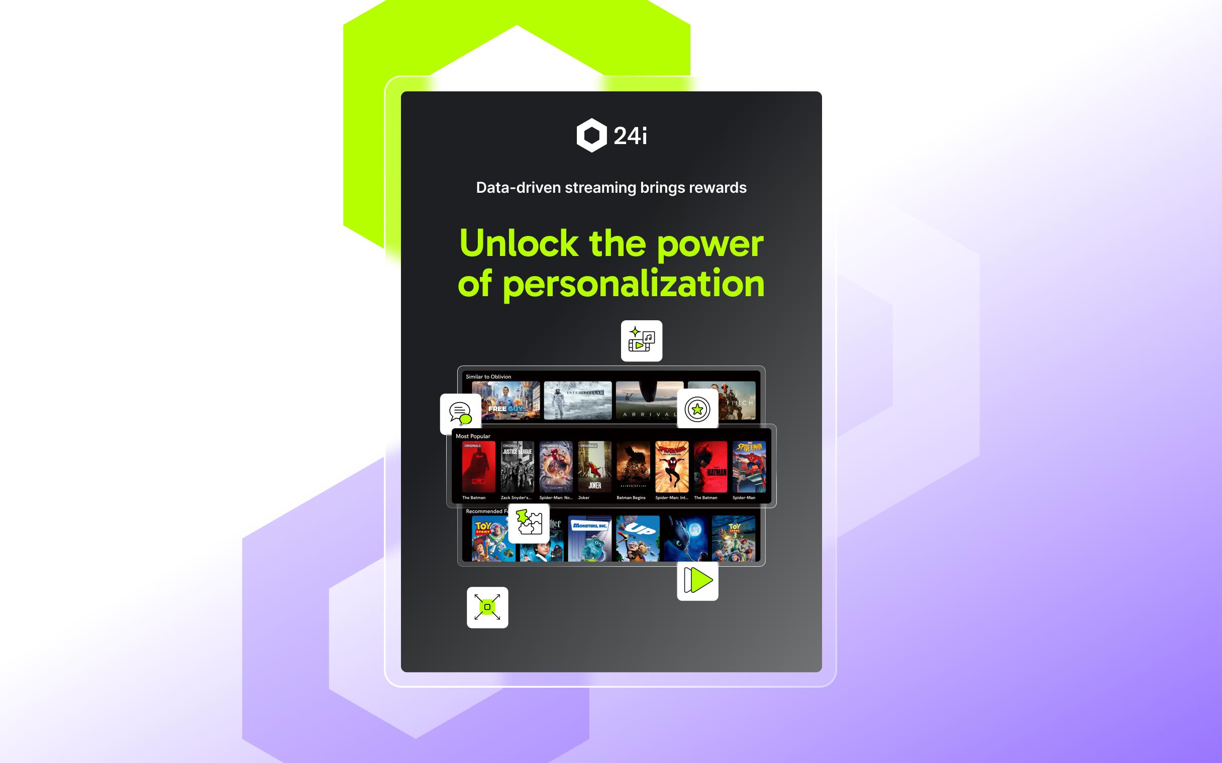
24i Video Cloud: How to Deliver A Data-Driven, Smarter Way to Stream
24i Video Cloud is an flexible, intelligent streaming solution that launches and grows your streaming service.


Knowledge Base

Streaming Glossary: All the Essential Terms You Need to Understand Streaming
Streaming Glossary: All the Essential Terms You Need to Understand Streaming
What Is An OTT Platform?
24i's comprehensive guide outlines how an OTT platform helps media companies launch, manage, and grow streaming services with flexible, data-driven infrastructure.
What Is An OTT Platform?
24i's comprehensive guide outlines how an OTT platform helps media companies launch, manage, and grow streaming services with flexible, data-driven infrastructure.
What Is Transcoding?
Transcoding prepares video for every screen. Learn how media transcoding supports adaptive streaming and global delivery.
What Is Transcoding?
Transcoding prepares video for every screen. Learn how media transcoding supports adaptive streaming and global delivery.
What Is Content Ingestion?
24i's comprehensive guide explains how content ingestion supports video workflows, automation, metadata, and monetization in modern streaming platforms.
What Is Content Ingestion?
24i's comprehensive guide explains how content ingestion supports video workflows, automation, metadata, and monetization in modern streaming platforms.
What Is a Video CMS?
24i's comprehensive guide explains how a video CMS helps OTT platforms manage content, metadata, and UX from one no-code, scalable system.
What Is a Video CMS?
24i's comprehensive guide explains how a video CMS helps OTT platforms manage content, metadata, and UX from one no-code, scalable system.
Ad Insertion Explained: How Modern Streaming Monetization Works
24i's comprehensive guide on how ad insertion works in streaming, from dynamic advertising to SSAI and real-time targeting. Read more here.
Ad Insertion Explained: How Modern Streaming Monetization Works
24i's comprehensive guide on how ad insertion works in streaming, from dynamic advertising to SSAI and real-time targeting. Read more here.